

In today’s digital age, where consumers have countless options at their fingertips, design plays a crucial role in attracting and retaining customers. A well-designed sales page can make all the difference in converting visitors into paying customers. It is not just about aesthetics; design has a direct impact on sales and conversions. A poorly designed sales page can lead to high bounce rates and lost opportunities, while a well-designed one can captivate visitors and guide them towards making a purchase.
Keep it Simple: The Power of Minimalism in Sales Page Design
When it comes to sales page design, less is often more. Minimalism is a design approach that focuses on simplicity and clarity, stripping away unnecessary elements to create a clean and visually appealing layout. By eliminating clutter and distractions, minimalism allows the key message and call to action to stand out.
One of the main benefits of minimalism in sales page design is improved user experience. A cluttered and overwhelming sales page can confuse visitors and make it difficult for them to find the information they need. On the other hand, a minimalist design makes it easy for users to navigate and understand the content, leading to higher engagement and conversions.
To simplify your sales page design, start by removing any unnecessary elements such as excessive text, images, or buttons. Use ample white space to create a clean and uncluttered layout. Focus on the key message and call to action, making them prominent and easy to find. Use clear headings and bullet points to break up the content and make it more scannable.
Colors that Sell: How to Choose the Right Color Scheme for Your Sales Page
Color plays a significant role in marketing and can have a powerful impact on consumer behavior. Different colors evoke different emotions and can influence how users perceive your brand and products. When choosing a color scheme for your sales page, it is essential to consider the psychology of color and how it aligns with your brand identity and target audience.
For example, blue is often associated with trust and reliability, making it a popular choice for financial institutions and technology companies. On the other hand, red is known to stimulate urgency and excitement, making it effective for limited-time offers or sales. Green is often associated with nature and health, making it suitable for eco-friendly or organic products.
When choosing a color scheme for your sales page, consider your brand’s personality and values. Think about the emotions you want to evoke in your target audience and choose colors that align with those emotions. It is also important to ensure that the colors you choose are visually appealing and create a harmonious overall design.
Typography Matters: Tips for Choosing Fonts that Enhance Your Sales Page
Typography may not be the first thing that comes to mind when designing a sales page, but it plays a crucial role in readability and user experience. The right font can enhance the overall design and make your sales page more engaging and persuasive.
When choosing fonts for your sales page, it is important to prioritize readability. Avoid using overly decorative or complex fonts that can be difficult to read, especially on smaller screens. Instead, opt for clean and legible fonts that are easy on the eyes.
Consider the tone and personality of your brand when choosing fonts. Different fonts convey different emotions and can help reinforce your brand identity. For example, a bold and modern font may be suitable for a tech startup, while a classic serif font may be more appropriate for a luxury brand.
It is also important to consider font hierarchy and use different font sizes and weights to guide users’ attention. Use larger fonts for headings and subheadings to make them stand out, while using smaller fonts for body text to ensure readability.
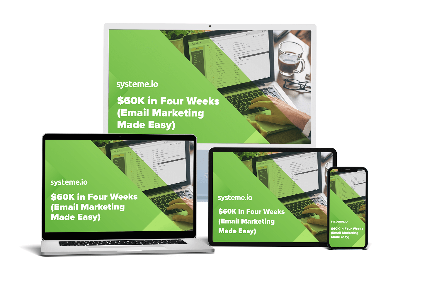
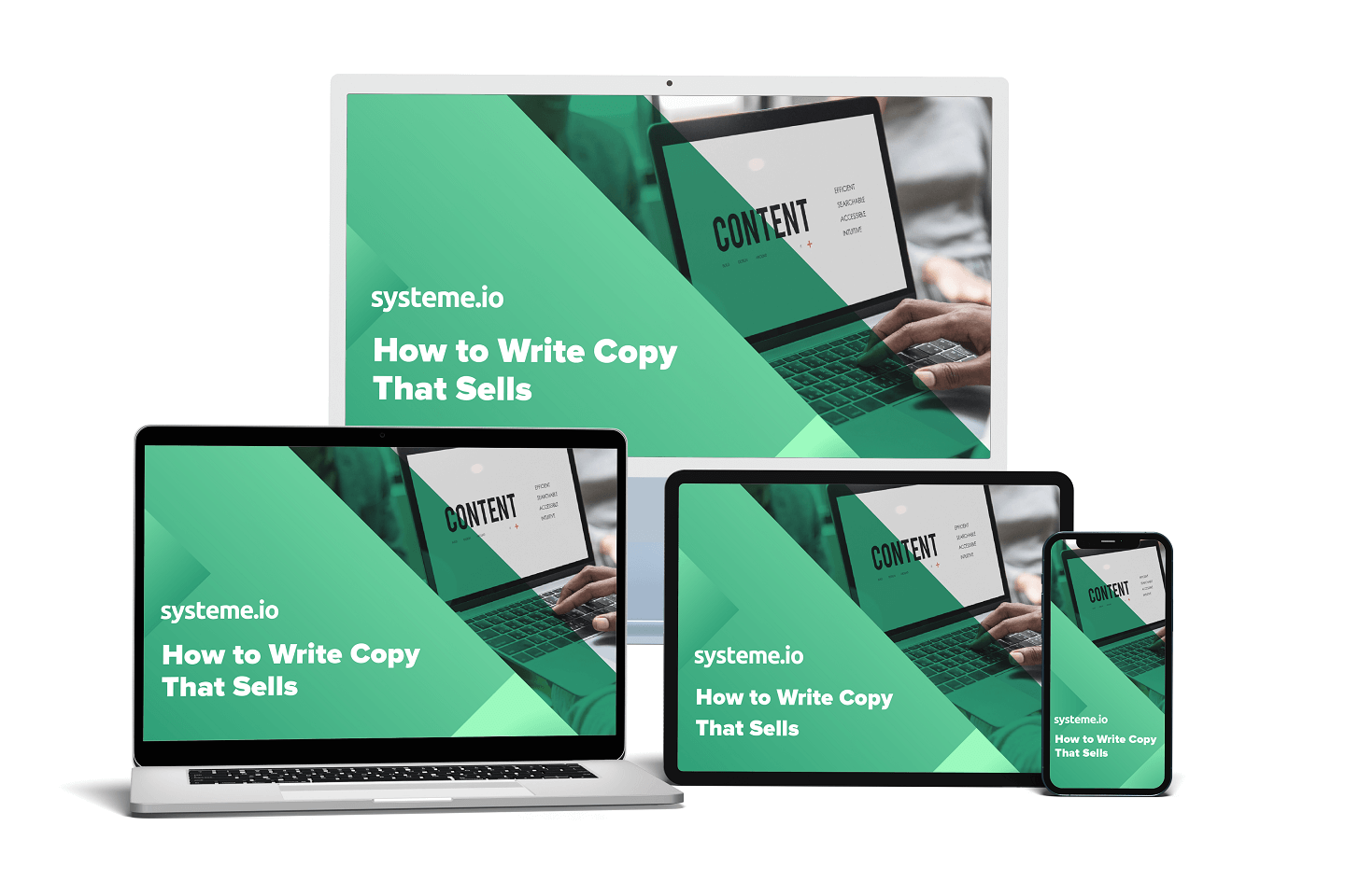
Use High-Quality Images: The Importance of Visuals in Sales Page Design
Visuals are a powerful tool in sales page design. They can capture attention, evoke emotions, and showcase products or services in a compelling way. High-quality images can significantly impact user engagement and conversions.
When using images on your sales page, it is important to choose high-quality and relevant visuals. Blurry or pixelated images can make your sales page appear unprofessional and may deter users from making a purchase. Invest in professional photography or use high-quality stock images that align with your brand and products.
In addition to product images, consider using lifestyle or contextual images that show your products in use or convey the desired emotions and benefits. For example, if you are selling fitness equipment, include images of people exercising or achieving their fitness goals.
It is also important to optimize your images for web to ensure fast loading times. Compress your images without sacrificing quality and use the appropriate file formats (JPEG for photographs, PNG for graphics) to minimize file size.
Make it Mobile-Friendly: Why Responsive Design is Crucial for Sales Pages
With the increasing use of smartphones and tablets, it is crucial for sales pages to be mobile-friendly. A responsive design ensures that your sales page looks and functions well on all devices, regardless of screen size.
The importance of mobile optimization cannot be overstated. According to a study by Google, 61% of users are unlikely to return to a mobile site they had trouble accessing, and 40% will visit a competitor’s site instead. If your sales page is not mobile-friendly, you risk losing potential customers and damaging your brand reputation.
To create a responsive sales page design, start by using a mobile-first approach. Design your sales page with mobile devices in mind first, and then adapt it for larger screens. Use responsive design techniques such as fluid grids, flexible images, and media queries to ensure that your sales page adapts seamlessly to different screen sizes.
Test your sales page on various devices and screen sizes to ensure that it looks and functions well across the board. Pay attention to touch-friendly elements such as buttons and forms, ensuring that they are easy to tap and interact with on mobile devices.
Add Social Proof: Using Testimonials and Reviews to Boost Sales
Social proof is a powerful psychological phenomenon that can significantly impact user trust and conversions. Testimonials and reviews from satisfied customers can provide social validation and reassure potential buyers that your products or services are worth their investment.
When incorporating testimonials and reviews into your sales page design, it is important to make them prominent and easy to find. Place them strategically throughout your sales page, especially near the call to action or product descriptions. Use compelling quotes or snippets that highlight the key benefits or results achieved by your customers.
Consider using real names, photos, or even video testimonials for added authenticity. Including specific details such as the customer’s location or occupation can also enhance credibility. If possible, include testimonials from well-known or influential individuals in your industry to further boost trust.
It is important to keep your testimonials and reviews up-to-date. Regularly collect feedback from your customers and update your sales page with fresh testimonials. This shows potential buyers that your products or services are consistently delivering value and satisfaction.
Call to Action: Designing Buttons and Forms that Encourage Action
The call to action (CTA) is arguably the most important element on your sales page. It is the final push that encourages users to take the desired action, whether it is making a purchase, signing up for a newsletter, or requesting more information.
When designing buttons and forms for your sales page, it is important to make them clear, compelling, and easy to find. Use contrasting colors to make your buttons stand out and ensure that they are large enough to be easily tapped on mobile devices.
Use persuasive language in your CTAs, focusing on the benefits or value proposition of taking the desired action. For example, instead of a generic “Submit” button, use a more compelling phrase such as “Get Started Now” or “Claim Your Free Trial.”
It is also important to minimize friction in your forms. Keep them short and only ask for essential information. Use autofill or pre-populate fields whenever possible to make it easier for users to complete the form. Consider using progress indicators or step-by-step forms to guide users through the process and reduce abandonment.
Use White Space: How to Create a Clean and Professional Sales Page Layout
White space, also known as negative space, refers to the empty space between elements on a page. It is a crucial design element that can significantly impact user experience and readability.
Contrary to popular belief, white space does not have to be white; it can be any color or even a pattern. The key is to create enough space between elements to allow them to breathe and stand out.
White space improves readability by reducing visual clutter and making it easier for users to focus on the content. It also enhances the overall aesthetics of your sales page, making it appear clean, professional, and visually appealing.
To create a clean and professional sales page layout, start by using ample white space around your headings, paragraphs, and images. Avoid cramming too much content or too many elements into a small space. Give each element enough room to breathe and ensure that there is enough space between different sections of your sales page.
Optimize Loading Speed: The Impact of Page Speed on Sales
Page speed is a critical factor in user experience and can have a significant impact on sales and conversions. According to research by Google, 53% of mobile site visits are abandoned if pages take longer than three seconds to load.
A slow-loading sales page can frustrate users and lead to high bounce rates. On the other hand, a fast-loading sales page can improve user engagement, increase conversions, and even boost search engine rankings.
To optimize your sales page loading speed, start by optimizing your images and other media files. Compress your images without sacrificing quality and use lazy loading techniques to load images only when they are visible on the screen.
Minimize the use of external scripts and plugins that can slow down your sales page. Combine and minify your CSS and JavaScript files to reduce the number of HTTP requests. Use browser caching to store static resources and reduce server load.
Regularly test your sales page loading speed using tools like Google PageSpeed Insights or GTmetrix. Identify any bottlenecks or performance issues and take steps to address them. Consider using a content delivery network (CDN) to deliver your sales page from servers closer to your users, reducing latency and improving loading times.
Putting it All Together to Create a Brilliant Sales Page
Design plays a crucial role in the success of your sales page. By keeping it simple, choosing the right color scheme, using typography effectively, incorporating high-quality images, making it mobile-friendly, adding social proof, designing compelling calls to action, using white space effectively, optimizing loading speed, and continuously testing and iterating, you can create a brilliant sales page that captivates visitors and drives conversions.
Remember that design is not a one-time task; it is an ongoing process of improvement. Continuously test different design elements, gather feedback from users, and make data-driven decisions to optimize your sales page over time. By prioritizing design and investing in creating a visually appealing and user-friendly sales page, you can significantly improve your chances of success in today’s competitive online marketplace.


0 Comments